From looking at these two websites Pichaus - Shared Pictures and Dieline Packaging I found a few interesting transparent labels. I mostly focused on the layout, simple imagery and type used. the majority of these designs use one or two colours of the same colour but different shades. Making it simple as possible but still making it attractive and impactful to the viewer. I need to think about this when applying my transparent design to the bottle and need to think about not getting it lost with the liquid inside the bottle and also with objects around when its situated in context.
Friday, 30 April 2010
Wednesday, 28 April 2010
Ikea Brochure Front Covers
Here I have looked at a few Ikea Brochure front covers for an inspiration for my set of advert posters I will be creating. The images focus on a message to relate to the imagery which creates a strong strap line. The front covers are all very high in colour photographic images which I would like to consider if I don't focus on typography this is something I need to research into. My two favourite front covers from the ones that I have selected are the mattress and bed images I think that the images work strongly with the message it is trying to create also I think what I find appealing is that the image is photographed well to create a strong visual impact.
Tuesday, 27 April 2010
Flower Typography
For my spring flower display I have looked at other type made out of flowers I was looking at how other people's creations have come out and what type of flowers they have used to get the best form of letters. The majority that I found looked very Photoshopped which is what I wanted to stay away from. I wanted mine to look as realistic as possible, the only good thing about the Photoshopped flower images is that they create a lot of impact. I think if I was to create my type out of real flowers I think the impact will still be there but not as high in colour this probably depends on what flowers I choose which I have already thought about and I want to use bright flowers and daisies.
Monday, 26 April 2010
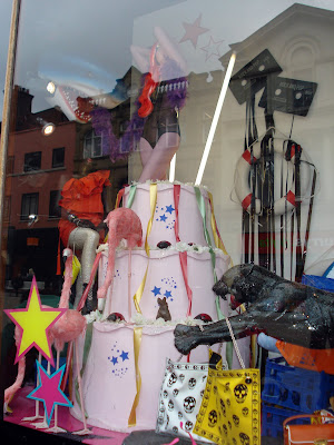
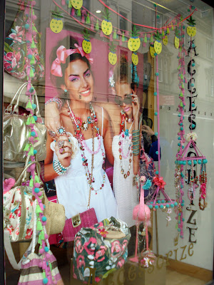
Primary Research of Shop Window Displays
I went around Leeds and took a selection of photos of show window displays that I found interesting and that stood out against the rest. I was looking for interesting visual imagery, bold and right colours, vinyl sticker designs, and typography. I also thought about the relevance it would have with my designs of seasons.
Shown below are several images that I think work well and give off an interesting appealing vibe from the layout of images and the colours used. I think the use of colour is very important when trying to grab people and passers by attention. I want colour to be my main focus when designing for my vinyl shop window displays working with typography. I will incorporate this to work effectively and become a relevance to my message.
Labels:
Primary Research,
Shop Window Designs,
Ted Baker
Thursday, 22 April 2010
Typography in Advertising
Articles from Style magazine
This advert caught my eye in Stylist magazine. It was the large bold type and the HI in caps. Again wordplay is used to create a message that relates to the product that the advert is promoting. For example: Emphasising on the HI! to create the message of high heels making the word HI taller then the word heels.
This advert is to promote the new minimiser available in Marks and Spencer. It has used wordplay and format to create an advert that is relating to the product that it is promoting. The strapline is also a main part of this advert ‘Makes a molehill out of a mountain’ and having this small to relate to the product. The colour of this advert not only draws you in because of its brightness but it is also the Marks and Spencer colour that they use.
This image has created the name of the shoe brand which is promoting by using the two shoe laces to show this. I think this is a clever visual and like how that using the object is used to create a message.
The new grip bottle for Coca Cola situated in Paris where, an advert made out of velcro where people could interact with it.
An advert for the New York Times newspaper
Subscribe to:
Comments (Atom)


