Adverts that I have looked at use images as the key element many of them work because they invite the viewer to finish the story off for themselves the examples that I have selected show that non verbal advertising don't have to use words to create a message, because the picture says more about the product.
Coca-Cola: Refrigerator Bus Shelter
Coca Cola set up a fridge in a bus shelter to promote the drink as an advertising campaign, I really like this as its something different to the usual drink advert or promotion. The whole idea of having it situated in a bus shelter is good as well because this is a place where a lot of people stop here and have to wait for the bus and whilst waiting they can have a drink.
Colorectal Cancer Association of Canada: Get your butt seen
These images show several impact visuals of photocopies and scanned images of peoples bums. These images are to create an awareness to get your bum checked for cancer. Now from a viewers point of view I would say this is more humourous way of putting the message across. With cancer being a scary and killing disease you would expect it to be a bit more scary then this to make you more aware of it it doesnt really have the drive of making you want to go to the doctor to get checked its more of an image to look at. These images are situated on billboards, toilets, the subway, web banners, and on TV adverts in Toronto and Montreal.
Salvation Army: Coin-shells, Bed
I think this is such a good idea to help the Salvation Army. The image of the person lying down on the floor draws you into the image to look but the clever thing about it is there is a hole at the top of the image where people can put coins into.
These coins then make a bed for the person in the image to lie on or a roof over the persons head. So its sending out the message of if you give money to the Salvation Army it can help in this way.
Peter MacCallum Cancer Centre: Take a break from the Sun
Using typography to create shadows with the sun creates an awareness of how bright the sun is and what it is doing so the shadow is creating the message for this awareness.
Channel – The Biggest Loser: Gut Loser
The concept of this advert works well with its message, having the paper dipped a little to show a message of bigger stomach. What I can gather it is promoting a TV program for the biggest loser couples. The typeface with the tape measure around it squeezing it together also suggests fat and losing weight which works well with the dipped paper.
Dubai Metro: Abandoned Cars
The message written in the dirty car is sending out the message basically saying clean my car if you want but Ive stopped using it as I use the Metro and I'm still using it. The concept of this is really good suggesting that the car has been left in that space for sometime because the driver has stopped using it because the Metro is better, so promoting the Metro to be the better transport to use.
Marie Claire: Clothing Trail
I really like the point of sale inside this shop for the Marie Claire magazine. The purpose for the skattered clothes on the floor was to promote the naked issue of the magazine, so they made it look like a woman had got undressed leaving a trail of clothes behind leading to the magazine on the shelf. These clothes on the floor are vinyl stickers having them on a plain floor is the main attraction and visually appealing when people from the public come in making them want to follow the trail where they then find the magazine on the counter.
Hygiene Color Bleach: Red Stain
Using the effects of colour and line they have created an image that plays with your eye so from far away you see a stain on the image but when you get closer the stain dissapears. This is a good and clever way to draw you into the advert so when you get closer to the image you can see what the image is trying to promote. This is a good idea for outdoor or large scale advertising.
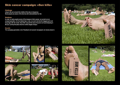
Stadt Apotheke, Kreuzlingen: Skin Cancer Guerilla
This was to create an awareness of what the sun can do to your skin if you stay in it for to long and that it can kill. This company went to a busy park and on the people who were asleep hung tags on their body. The tags held information about the damages of what the sun can do to your skin creating an awareness. I think this is a clever way of doing its obvious that people are going to read it, waking up to something hanging on you is going to make you want to look closer and read it.
Leekaja Hairbis: Sweet & lovely style for you
I think this is a really creative way of a promotion for a hair salon. Giving out ice creams with the cone acting as a hair style whilst the cone is of a woman's face so it looks like a hairstyle on a persons head. After you have finished eating it the cone unravels to reveal details of the salon and a coupon of a discount. This is a good and different way of promoting a hair salon I think if you got this without being told you wouldn't guess that its promoting a hair salon you would think it would be for a cafe or resturant or new ice cream flavours.
Restaurant Binnen: Lipstick Glasses
This is so similar to what I thought about doing for my Bacardi brief with the lip mark typeface I designed. I wanted to stick the typeface or a few letters on to the glass to act as lip marks left on a glass. This advert though is advertising something different it was advertising for a glass cleaner and plate washer for the pub. On it is a lip mark with details underneath very small about applying to work there as a glass and plate washer. This is such a clever and different way of promoting for something like this, its not your usual poster or flyer and is a innotive and creative way of thinking using the actual object they want the job for to use it as a advertisement.
Greenpeace: The Puddles
Friends of Cancer Patients: Beach Towel
GBB Beauty Salon: Bikini Waxing Salon Poster
Demagraphic Tattoo: Try before you buy
Ikea Balcony
http://www.toxel.com/inspiration/2010/01/12/clever-and-creative-ikea-advertising/
Ikea Billboard
Ikea Apartment in a Box
Ikea Messy Bus Shelters
Ikea's World Biggest Rack
Ikea Bus Stop
Ikea Staircase
Ikea Train in Japan
More Ikea advertisiments


No comments:
Post a Comment