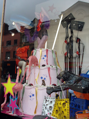
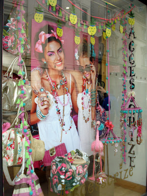
I went around Leeds and took a selection of photos of show window displays that I found interesting and that stood out against the rest. I was looking for interesting visual imagery, bold and right colours, vinyl sticker designs, and typography. I also thought about the relevance it would have with my designs of seasons.
Shown below are several images that I think work well and give off an interesting appealing vibe from the layout of images and the colours used. I think the use of colour is very important when trying to grab people and passers by attention. I want colour to be my main focus when designing for my vinyl shop window displays working with typography. I will incorporate this to work effectively and become a relevance to my message.


No comments:
Post a Comment