- Contents Page
- Introduction
- Visits, Interviews, Questionnaires
- Quotes from Dissertation and from the Interviews
- Experimental Typography
- Type and Layout
- Outdoor Large Scale Advertising
- Promotional Advertising
- Retail Design
- Lee Bennett from Propaganda in Leeds
- Micheal Smith from Elmwood in Soho London
- Seb Lester - Typographer
- Kate Shepard the Project Manager of Pentagram
- Bea Bluamenthal the Design Assistant for Domenic Lippa
- Paul Dodd from All Good Design in Leeds
- Andy O'Donnell from Dewynters in London
- Suki from Lollipop Creative in London
- James Russell from Definitive in Leeds
1. What makes you as a designer?
2. What is your main inspiration or inspirations that influences your design work?
3. I specialise in design for Advertising and Promotion what would be the best way to get myself into the industry?
4. What advice can you give to make myself stand out against other designers out there who are graduating?
5. I am coming out of university in June what is the best advice you can give me for a starting point that I can furthur?
I am also in the process of researching into relevant design studios and agencies, and looking at their work as an inspiration which I would like to add a few pieces in my book.
- Spot co NYC
- Z design UK Ltd - Milton Keynes
- Mulberry Advertising - Essex
- Sizzle Creative - Bury
- T2 Studios - Peterborough
- Signboards corporate identity - London
- Parallax Graphics - Brixton London
- Wooden House Design and Media - Cambridge
- Native Brand - Cambridge
- Ninet6 - London
- Armcom - Bedford
- Saatchi and Saatchi - London
- Boxhead - Leeds
- Propaganda - Leeds
- Dsemotion - London and Leeds
- Dewynters - London
- Elmwood - Soho London
- Definitive - Leeds
Thinking about the Design Context book I thought the best way to display my research etc and the best way to show me as a designer and where my interests lie in design was to relate it to my work in someway. So firstly I thought about doing a book where you can pull the pages out to be bigger either horizontal or vertical the reason for this is because I am interested in design for advertising and promotion at a large scale and the majority of my research is based around this. My inspiration for this idea came from the designer Chris van Diemen.
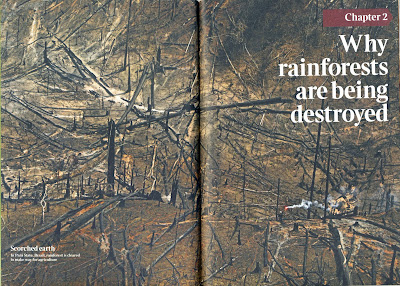
I have also looked at extending the pages of the book so they are a bigger size to the actual book itself so having long landscape pages in a A4 portrait size book, like the image shown below. Or to have a long landscape book to display the contents in.
I want a simple layout design because I wanting to display the images, for now I also want to stick to the colours black, white and grey. Using a sans serif font for the main body of the text, bold for the headings, and italic for the quotes. The typeface is something I need to research in before I deside on the style of the layout.
Chris van Diemen

Book and Layout Design


No comments:
Post a Comment