

Friday, 28 May 2010
Daniel Eatock
Recently the new Big Brother Logo has come out for 2010 and alot of people have said that it looks like my design for the spring window display which I created out of flowers, I did it ages ago but still it does look quite similar so I did some research and found out that the designer Daniel Eatock created it. Was going to see if I could get in contact with him and see how he did and if he used real flowers like me or just used photoshop but I can't seem to find his contact details.

Wednesday, 12 May 2010
Creative Advertising
I was looking through a book called Creative Advertising by Thames and Hudson. I mostly focused on looking at how image on its on creates a message and how using typography and the layout of type interprets a message to the viewer.
This image below compares and contrasts the benefit with the problem this is a classic way of advertising. The comparison to me was obvious but sometimes in other adverts it can create tension and also humour. Using typography to create the dandruff spelling out the message 'before' and then on the other side the hair is clear. The advert 'Before and After' suggests that head and shoulders is good for dandruff.

This image below shows the opposite to what the viewer expects which can result to surprise and interesting ideas for example doing the opposite to usual, making a big thing small, making beauty look ugly and ugly into beautiful etc. The image below is advertising Olay moisturising cream promoting it using typography using the number 61 but when you look at the advert upside down it shows the number 19 the message that they are trying to put across is that use Olay moisturising cream to make your skin look younger. This is an effective and clever way of using type in an advert it is also a very simple and clear idea to get the message across.

This image below highlights the importance of packaging design, using typographic messages to tell the viewer about its features without using imagery to convey a message just using a two colour printed design making it simple and fairly clear.

The image below uses symbols to create a visual image. Symbols in adverts can stand for an object, a concept or a situation and also effective communication such as convey information that can't be expressed in words.
The images for this ready meal pouches campaign is giving the message of 'for a proper meal cut corners' the images in the corner where their is the dotted line to cut off shows symbols of objects that make a meal but in more time so they think that also using meal pouches creates less time.

This advert below focuses alot on its audience and how to grab the attention of them by getting them involved. This advertising campaign lets readers peel of stickers of dogs from the margin to put into the picture to find out whether it's the right dog for them.

These two adverts advertising bic razors where placed next to each other in a magazine incorporating the bic biro pens in with the advert for bic razors. It tells the story of a product and a service.
The other advert below the bic advert is advertising Ariel. Posters were wrapped around a street corner, so that viewers can only see one person first for example the little girl with ice cream in her hand. When viewers walk around the corner, they see the second part and can complete the story.


Some adverts contain phrases, metaphors, slang expressions which when viewers look at them they contain jokes or serious messages. Often word translations in adverts often leads to comical or surprising things that can be turned into successful campaigns.
For example the advert below advertising Midori Frozen Margartitas using the images of flowers put into a freezer this is because the name of the cocktail 'margarita' is the Spanish word for daisy.

Word Play is another way of advertising basically playing with words to make pictures with them its an experimentation with type so that the type turns into an image.
The McDonald's advert uses the rucksack as its symbol to create the letter M out of the handles it uses this to get the message across without using typography.

Alternative media is another way of advertising more on a larger scale attracting passers-by to create more or a visibility for example this advert for Tom's Saloon for Gays. Its an outdoor advert which is a a yellow circle with a small message advertising the saloon so to read the message people have to bend over or down to read it mimicking the action of gay people.

Another use of alternative media is this advert for foaming face wash Olay, this advert shows the dramatic effects of oily skin, to show this a portrait of a woman was printed on the base of a pizza box to leave grease marks.
 The use of typography in advertising is also another way of creating a message just by altering the type for instance this image below a question mark has been used instead of the later to P to create the word Pregnancy Test. This creates the message of question are you pregnant? to find out take a test.


These two adverts advertising bic razors where placed next to each other in a magazine incorporating the bic biro pens in with the advert for bic razors. It tells the story of a product and a service.
The other advert below the bic advert is advertising Ariel. Posters were wrapped around a street corner, so that viewers can only see one person first for example the little girl with ice cream in her hand. When viewers walk around the corner, they see the second part and can complete the story.


Some adverts contain phrases, metaphors, slang expressions which when viewers look at them they contain jokes or serious messages. Often word translations in adverts often leads to comical or surprising things that can be turned into successful campaigns.
For example the advert below advertising Midori Frozen Margartitas using the images of flowers put into a freezer this is because the name of the cocktail 'margarita' is the Spanish word for daisy.

Word Play is another way of advertising basically playing with words to make pictures with them its an experimentation with type so that the type turns into an image.
The McDonald's advert uses the rucksack as its symbol to create the letter M out of the handles it uses this to get the message across without using typography.

Alternative media is another way of advertising more on a larger scale attracting passers-by to create more or a visibility for example this advert for Tom's Saloon for Gays. Its an outdoor advert which is a a yellow circle with a small message advertising the saloon so to read the message people have to bend over or down to read it mimicking the action of gay people.

Another use of alternative media is this advert for foaming face wash Olay, this advert shows the dramatic effects of oily skin, to show this a portrait of a woman was printed on the base of a pizza box to leave grease marks.


Thursday, 6 May 2010
Mail Shots and other advertising for Ikea
Here are a few inspirational ideas for the mail shot I will be designing for IKEA. The designers have creatively thought about the use of the objects that they sell for example, using the format of paper in a magazine advert to act as an opening of a wardrobe to reveal the contents of a wardrobe and products from IKEA.

This mail shot promotes a fold out futon sofa bed. Again using the format or paper to demonstrate this by having a piece of paper so when folded out it reveals the product, so its using the product and its purpose to form a mail shot.


This mail shot promotes a fold out futon sofa bed. Again using the format or paper to demonstrate this by having a piece of paper so when folded out it reveals the product, so its using the product and its purpose to form a mail shot.

Tuesday, 4 May 2010
Optic Spirit Bottles
Here I have looked at some optic drink bottle labels for inspiration for the design for my optic drink label. The use of bold colours and type are used to create a high impact image to be seen against the bright lighting the coloured bottles and from across the bar.


Existing Bacardi Labels
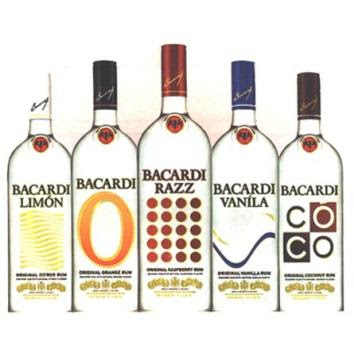
Here I have looked at a range of different Bacardi labels, looking at the layout of type and the different stocks the designs have been printed on. My idea is that I want to print my labels on transparent adhesive paper so it goes with the rest of my products demonstrating lip marks on glass. The transparent labels designs are all very bold making them stand out off the clear bottle using prominent and bold colours. On recent and previous Bacardi bottles they have using a lot of pattern work to show the flavours of the drinks. The layout of the type is also an important thing for the label as it has to be legible and clear to read on a shop shelf and across a bar.


Monday, 3 May 2010
Typography
From looking at the Graphic Design Blog I collected a few images that I thought were visually appealing and what I thought were creatively interesting not only for its design but its concept.

This image above is created out of human body parts, fingers to create a letter form this is relative to my typeface that I have created out of female's legs. The designer has used shading to create a more rounded letter form.


This type looks as those the image has already been created to create a scene behind the bold typeface creating a clipping mask. I think having the image on a black background makes the type not very clear to read I can't tell the what the message is trying to convey and if it is relative to the image that the type is made out of. I still think though that it makes an appealing image just with the smoky white effect.


This image above is created out of human body parts, fingers to create a letter form this is relative to my typeface that I have created out of female's legs. The designer has used shading to create a more rounded letter form.

This typeface has been created out of an overlay of colour and shape to not only form a typeface but a pattern which creates a strong image. I like the use of tones that have been used and rounded shapes to create the letters.

Using objects is also a strong way of creating a typeface. Using bulldog clips gives this typeface a sharp look and boldness of image.


The concept of this design works really well with its message creating a smashed effect to act as an object in the wind to smash the glass when actually the process of this was a snooker ball being thrown on the glass whilst the camera shoots the smash. The simple clear type is all this design needs as the concept using the smashed glass visually demonstrates the message making it more interesting.

Ive found a lot of designs that use the parts of the actual product to create the message take the image above for instance using left overs of the needles of the christmas tree to create the message of 'Christmas is over' this relates to the pieces use to create the type over.

This type looks as those the image has already been created to create a scene behind the bold typeface creating a clipping mask. I think having the image on a black background makes the type not very clear to read I can't tell the what the message is trying to convey and if it is relative to the image that the type is made out of. I still think though that it makes an appealing image just with the smoky white effect.


This detailed illustrated really makes this type visually interesting but also makes it quite hard to read but the form of the letter that has been created has each taken time, you can see this by the weight of line that has been used and it doesn't look rushed I also like how each letter has been hand rendered making each letter its own. The yellow circles highlight specific areas of each letter give it that extra vibrant touch.

Again using human parts to create a typeface which is also relative to my concept of the leg typeface for Bacardi. I think if small areas of this were highlighted with a bit of colour you would be able to tell what the images were that were forming the typeface a bit more clearly rather then keeping the type to greyscale.


I like the use of using actual objects to create to form type this is why I went with creating type out of flowers for part of my Ted Baker brief and creating type out of my Lip marks for my Bacardi brief as I wanted to do something different to what I have done before and instead of using vectored imagery to create a letter form. Again below is the same concept using items to create a letterform this type paper folding has been used to create a letter form. I don't think this typeface is as strong to read as the others show above the form of the letter is not as clear the first 4 letters are but from then its quite hard.


The two images below I found off Behance which are created by a designer called Bela Borsodi. It looks as though the design of this has really been thought about, the way the objects have been constructed to form the letter is very neat and legible. The colours used as well all suit each other in the image making it easy on the eye and also having the letters on a plain colour background makes the letter stand out.


I really like the luminous colours used to create this design and type it also works well on the stock that it has been printed on giving it a glow effect making it become more vibrant looking.


Applying type to other materials and products is a good way to show a thought process and to where you see your designs being situated in the real world, this is something I need to think about with the typefaces that I have created on what products I want to apply it to.


I found this typeface shown in the YCN book, the reason for me choosing this was I found it relative to what I have been doing with the typeface for Bacardi out of female legs.

Subscribe to:
Comments (Atom)