
Scanning through the book a few things caught my eye, I was mainly focusing on the impact of the designs as this is something I focus on in my work. I also was looking for colourful images and also the equipment used to create the image as this is also something that interests me.
This typeface below by Emily Anderson was to demonstrate strands of hair to create a letter form, she has used one strand of hair to show this. The context that the typeface has been put in works really with the style and form of the letters and you can straight away what it is trying to demonstrate.


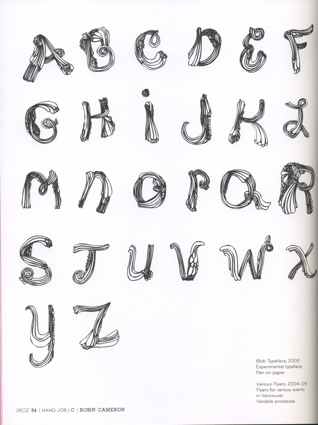
This typeface below is called the Blob typeface by Robin Cameron, he used just pen and paper to create this type the style of this looks quite similar to the flow of hair. It is made up of many curved shapes and lines to form the letters. The weight of line is also different in areas to show the boldness of the letter and the 3D form of it. This typeface was used for flyers for various events in Vancouver.

These two typefaces have been created by Paul Clark his style comes across as quite bold and heavy to create and impactful image. The weight of line is shown through this and shading to create the letters 3D to make it look uplifting from the page. I like the style that he has to make his images stand out and his used of block lettering.


This typeface created by Damien Correll called Hugs for you, really attracted me not just for its message but its style of type, creating it to look like tree trunks. The black heavy type using a halftone effect in parts to create impact and the wight of line to form the type also. The type is also really easy to read and is straight away there in your eye contact.

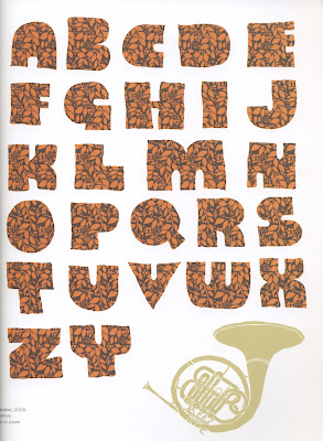
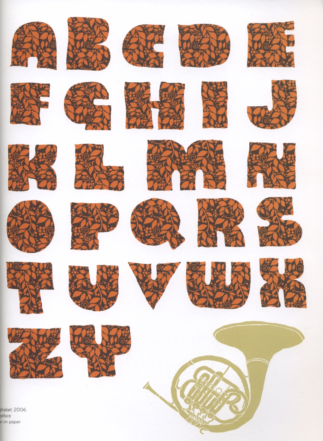
This typeface below caught my eye because of its patterned design it shows to create the type it was the form of the typeface because I don't think that is that strong. This was created by a designer called Dan Funderburgh. From looking at his website his style of his design is all design based on pattern and decorative design and applying his designs to products etc, the commissioned work he does is a little bit different but still you can see that his style of design is shown throughout it.
Here are a few other pieces of his work from his website that I liked.
This piece of work was designed for Hewlett Packard. I like all the line vector drawings of the possible items that Hewlett sell and how the typeface is intwined into this merging it all together. The colours are simple but still grabs attention to the viewer.

Here he has applied his type design to a product skate boards, this is something that I need to think about doing is applying my type to design to other things not just the usual poster, flyer etc.

This piece was designed for The Artists Guide. where it folds out to be a poster, I like the format of this poster as its not the typical A format, he has also used the space wisely to lay out his design. The style of fonts used is the main attraction to this. The decorative shapes used is something I would like to consider using in my shop window displays as it excentuates the type more and makes it stand out against the others giving it more of a hireachy.

This image of the Blob typeface is designed by Jim the illustrator, his style of design is not really like mine but I chose this because it appealed to me and I thought it was quite humorous and creative. It is not something that inspires me to do as my area doesn't focus in illustration but it inspires me to touch this area where I can develop it furthur.

No comments:
Post a Comment