
I think these are really effective using type they create an interesting visual with the choice of type chosen and layout. He has created a set of 30 cards that each represent a classic typeface which include the typeface statistics and the year of the design the amount of weights and costs. He has also given each typeface a rating score and even a special power in the game. I like the limited colour palette he has chosen and is makes the cards work more of a set and also they are not clashing with each other.


This is created by a company called 300million. I really like the layout of type and the style of typography used to create a solid layout also the phrases used are catching to read and look inside the book to see what it holds. The different weights of type really break up the messages making it easier to read. Looking at the image below this it has given me a layout idea for my design context book. I like the use of letters it has used to create a paragraph of text and that it creates a visual image.

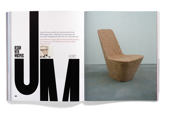
The other piece of layout work that I thought would be quite nice for my design context was the design shown below. I like the use of colour that breaks up the information and images from each other.

Another piece of work that I found on there website 300million was a Poster for a festival, I've noticed in other images where designers create faces out of type that it is sometimes hard to read the words but in this one the break up of words are legiable and the touch of colour used to highlight areas of the face makes it look really effective and stand out.

No comments:
Post a Comment